Imperial College London
Imperial College London is a globally-renowned university, pushing the boundaries of science, engineering, medicine, and business. With multiple campuses across London and the South East, it is a powerhouse of innovation and academic excellence. Their commercial arm approached us to rebrand their venues and accommodation offers. Originally two separate sides of the business, a new strategy meant they would be coming together as a united offer under one, new brand.
Strategy + Branding + Naming + Brand Accessibility
Context
Imperial College London is one of the world’s leading universities, known for excellence in education and research. Alongside its academic mission, it operates a significant commercial arm managing an extensive portfolio of venues and accommodation across London.
With multiple campuses across the city, Imperial offers a scale of venues and accommodation few institutions can match. Yet despite this breadth, the portfolio was split between two separate entities, each with its own identity and messaging. To external audiences, the offer lacked clarity. To internal teams, it meant duplication, inconsistency and missed opportunities.
For a university of Imperial’s reputation, this was holding back a valuable revenue stream and underplaying the quality of what was on offer.
Immersion
We worked closely with Imperial’s teams to understand how the two entities operated and how they were perceived by clients and audiences. The venues and accommodation were exceptional, but the brand story failed to capture their scale or connect them to the authority of Imperial. This gap between quality and perception became the starting point for change.
Strategy
The strategy was to bring the two entities together under one brand. The goal: create a single identity that could express the scale of the portfolio, compete confidently in London’s commercial landscape and internationally, and still connect back to Imperial’s reputation for excellence.
The pivot was clear, move from fragmented services to a unified, ambitious brand that represented the combined strength of Imperial’s venues and accommodation.
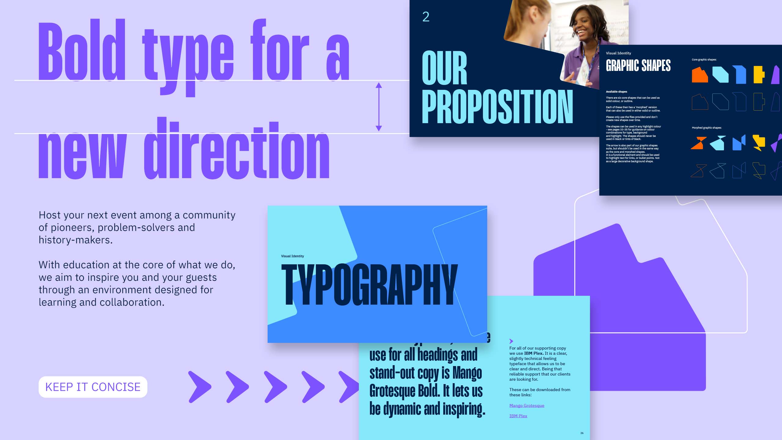
Accessibility was embedded as a core principle within the brand, ensuring it could communicate clearly across diverse audiences, from international stakeholders to internal teams. This strengthened consistency, usability and reach, supporting confident adoption across the organisation.

The workshops… solidified where the project was going and who we were, and raised important considerations around rollout and internal change.

Expression
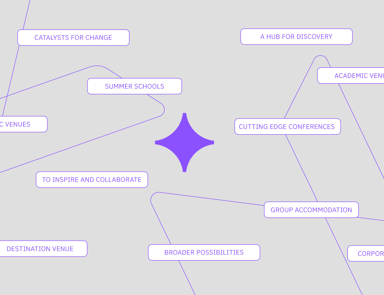
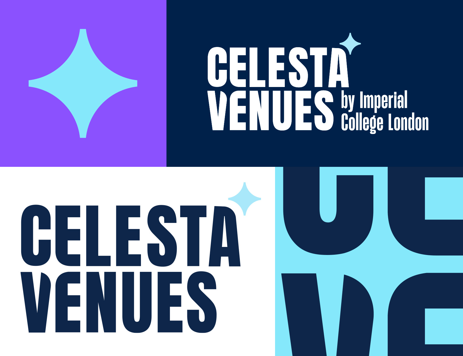
The new name, Celesta Venues, captured this ambition. Inspired by lightness and clarity, it gave the portfolio a distinct voice while aligning with Imperial’s forward-looking values.
The identity system was designed to express professionalism and prestige, while remaining flexible for varied audiences, from international conference organisers to students booking summer accommodation. Visual and verbal frameworks gave the team tools to communicate consistently and with confidence.
Activation
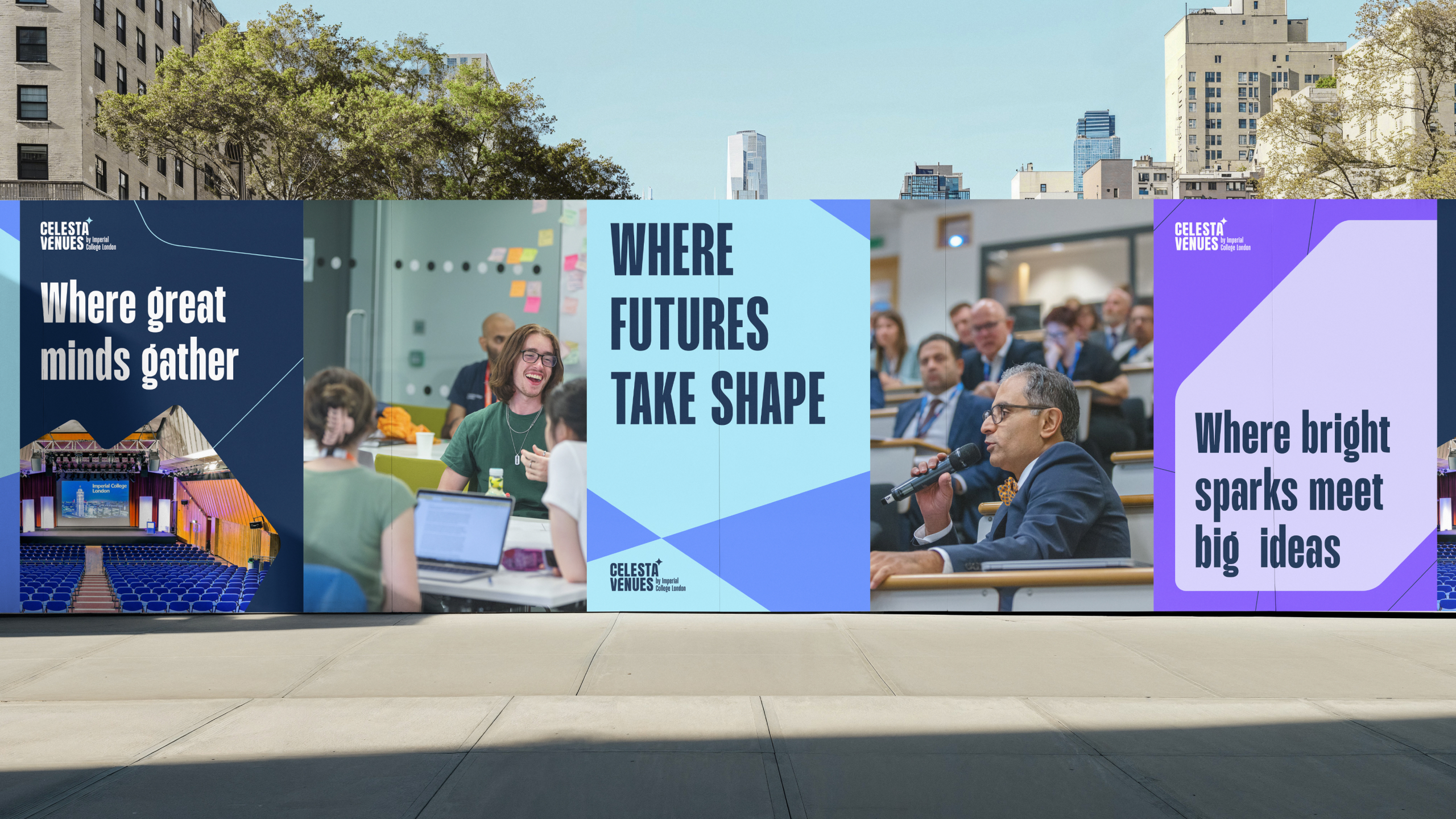
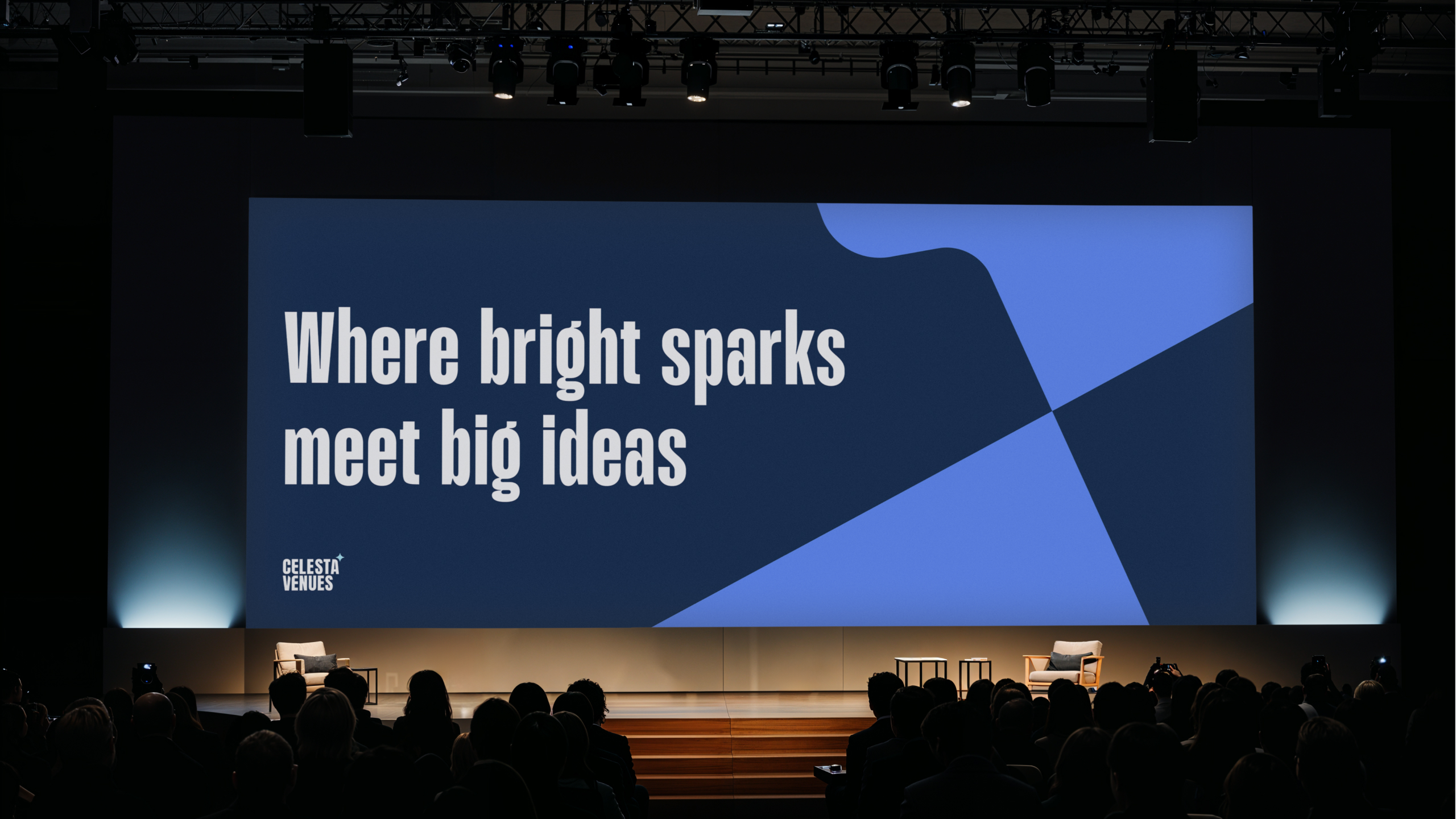
Celesta Venues launched with a full brand rollout across digital platforms, marketing materials and on-site communications. By unifying venues and accommodation under one system, Imperial could present a clear, compelling offer to audiences in London and beyond.
Training and guidelines supported staff in adopting the new brand, ensuring it could be applied consistently at every touchpoint.

Impact
Celesta Venues has transformed how Imperial’s commercial arm is seen and used. What was once fragmented is now a unified brand with the clarity and authority to compete in one of the world’s most competitive markets.
Externally, Celesta Venues communicates the scale and quality of Imperial’s portfolio. Internally, the team now works with clarity and alignment, supported by tools that make activation simple and consistent.
Celesta Venues is more than a name, it’s a brand that strengthens Imperial’s commercial reach and reinforces its role as one of the world’s most ambitious universities.
Our new name and brand identity is an important step in bringing our vision to life… will further embed Celesta Venues’ position…
Related projects
Start Network
Turning complexity into clarity to showcase global humanitarian impact
Fish Legal
From petition to precedent, securing a landmark legal victory for river health