booktrust
BookTrust had been running for over 100 years when they came to us wanting to refresh their brand identity. With so many important and ambitious campaigns, they had become disjointed over the years. It was important that they presented a unified and coherent identity.
Charity: Brand architecture + Branding + Digital + Own-brand identities + Brand Strategy
Writing the last page first with brand audits
For the project to be a success we needed a clear end point, and a mapped out way to get there. We conducted a comprehensive brand audit for BookTrust to initiate their rebranding. This clarified key objectives: establish a framework for program branding, implement a consistent system for colour and illustration, enhance brand accessibility in both print and digital media, and make sure that this guidance was easy for BookTrust’s internal teams to carry forward.

Laying the foundational structures
We developed a brand architecture system that allowed BookTrust to grow. With the new architecture and logo design system, BookTrust could add to their portfolio of programmes and initiatives without worrying if they would remain on-brand.
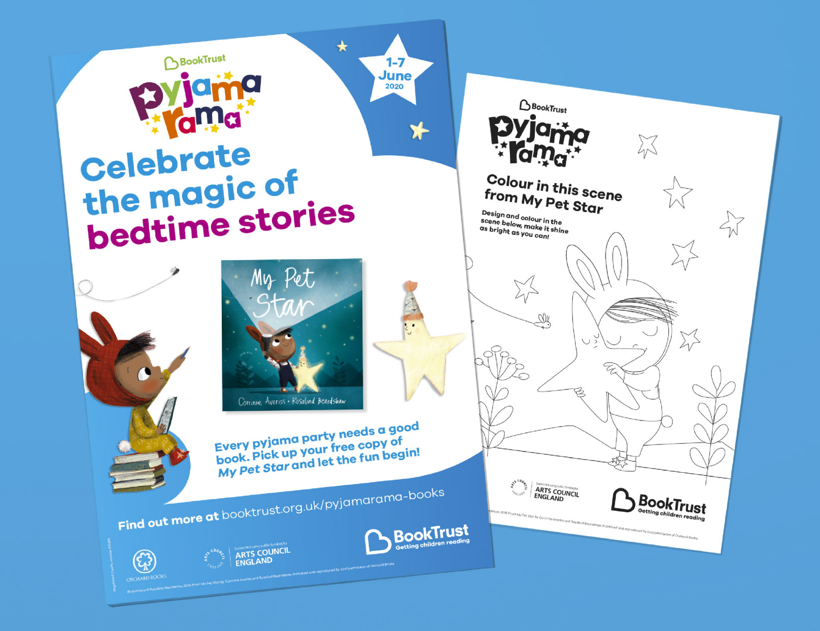
For further clarity and consistency, the brand was then divided across five brand pillars. This helped create further brand recognition within each age group that BookTrust come into contact with. For Babies, parents would become familiar with the yellow and blue branding, as their children grew, they would move through into the primary blue, and secondary green colour palettes.
For when BookTrust are talking to other organisations, or their core adult audience, they lean on their teal and navy which have long been the primary colours within the palette. Helping to solidify that core brand.

Illustrations
For each pillar, a suite of illustrations was built out with relevant scenes for each age range. Making sure that the illustrations would feel relevant and help BookTrust convey a meaningful message to their audience.
It was important that BookTrust was inclusive, and that their broad audience would feel represented within their illustrations. So this was a focus whilst creating the characters along with making sure that the illustrations presented reading in a positive, and often magical light.
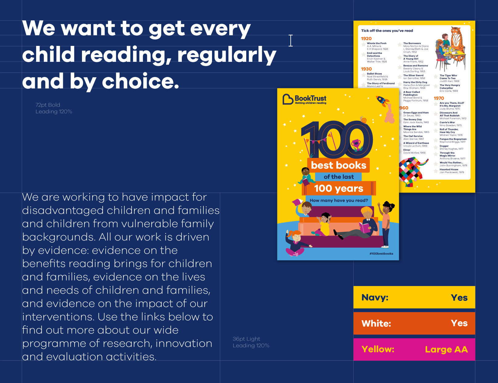
Making sure all children can access BookTrust
BookTrust’s good work would be nothing if they couldn’t reach the people that they need to. So making sure their brand refresh included a keen eye for accessibility was important. We ran a full brand accessibility audit which revealed BookTrust’s strengths and where they were falling short. This was then used to develop a set of accessibility guidelines. This covered everything from how their typography should be styled through to making sure every colour combination they used would be accessible to WCAG AA standard.
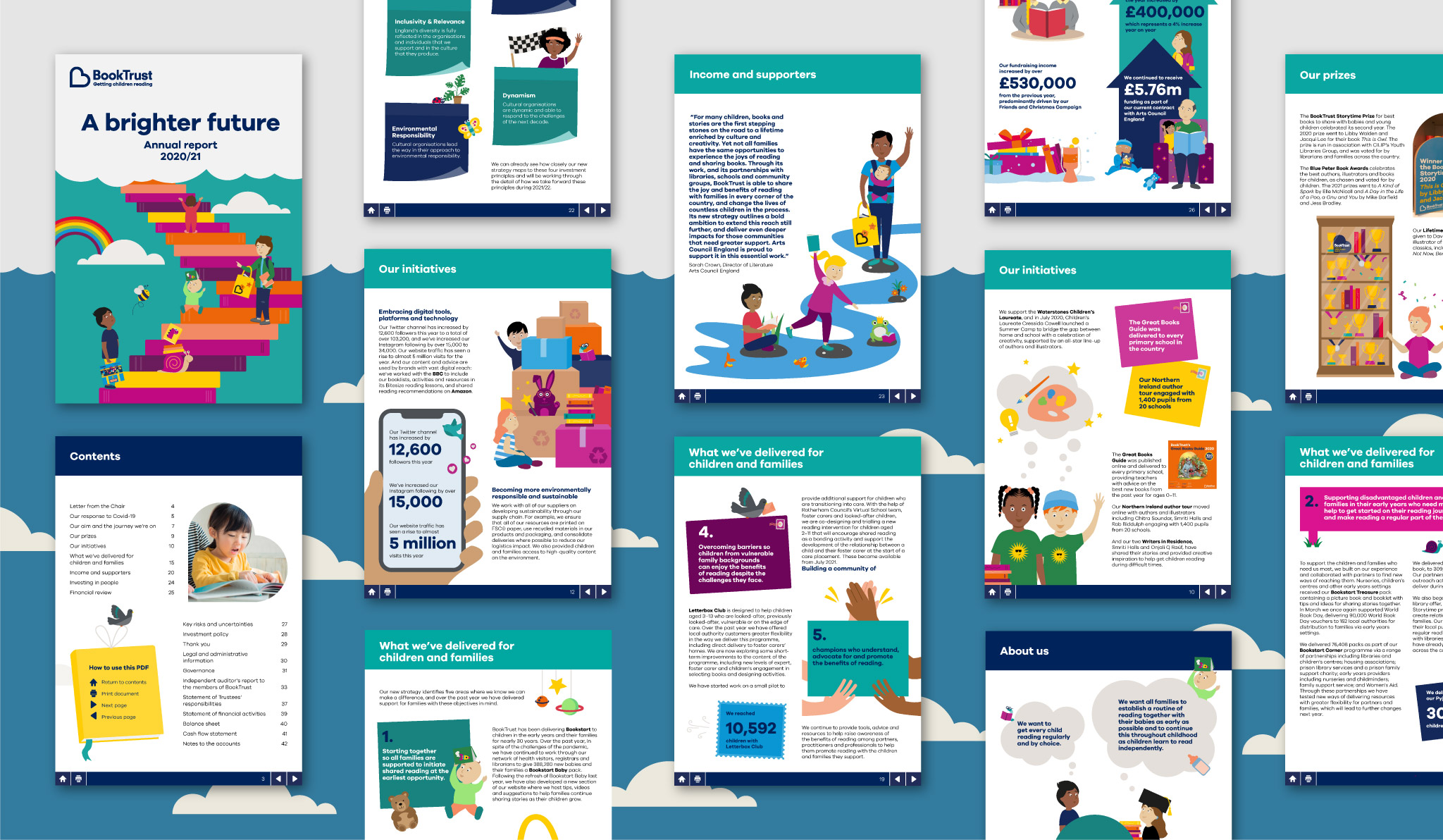
For BookTrust’s more adult audience, the important reading happens with their annual report and their impact reports. We designed and created annual reports that were full of the energy and imagination that BookTrust represents but also importantly, they were fully accessible PDFs optimised for screenreaders.
As a charitable organisation, the impact report in particular needed a wide reach. Making sure that their audience could see the impact of all of BookTrust’s great work, and the value they could be adding with donations and fundraising. So a campaign that would launch alongside the impact report was created, to make sure even the report itself made a big impact.
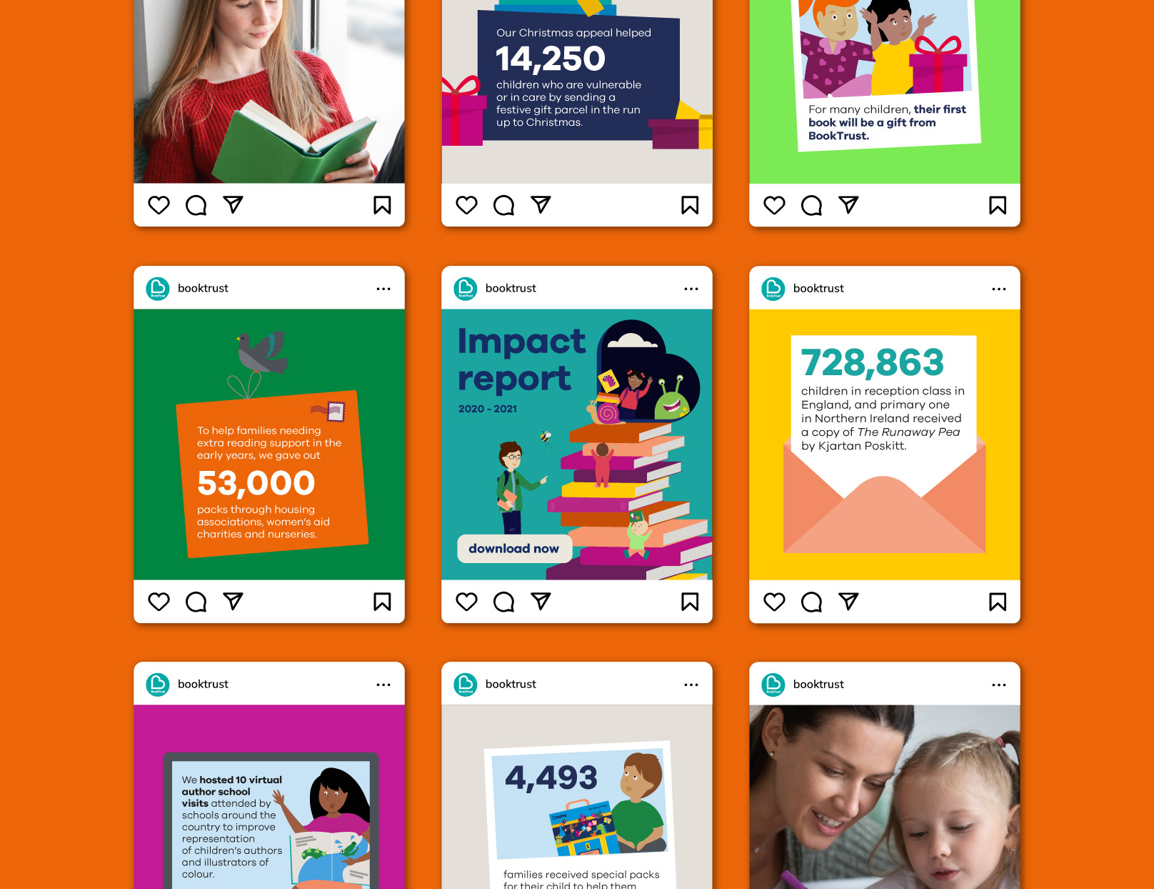
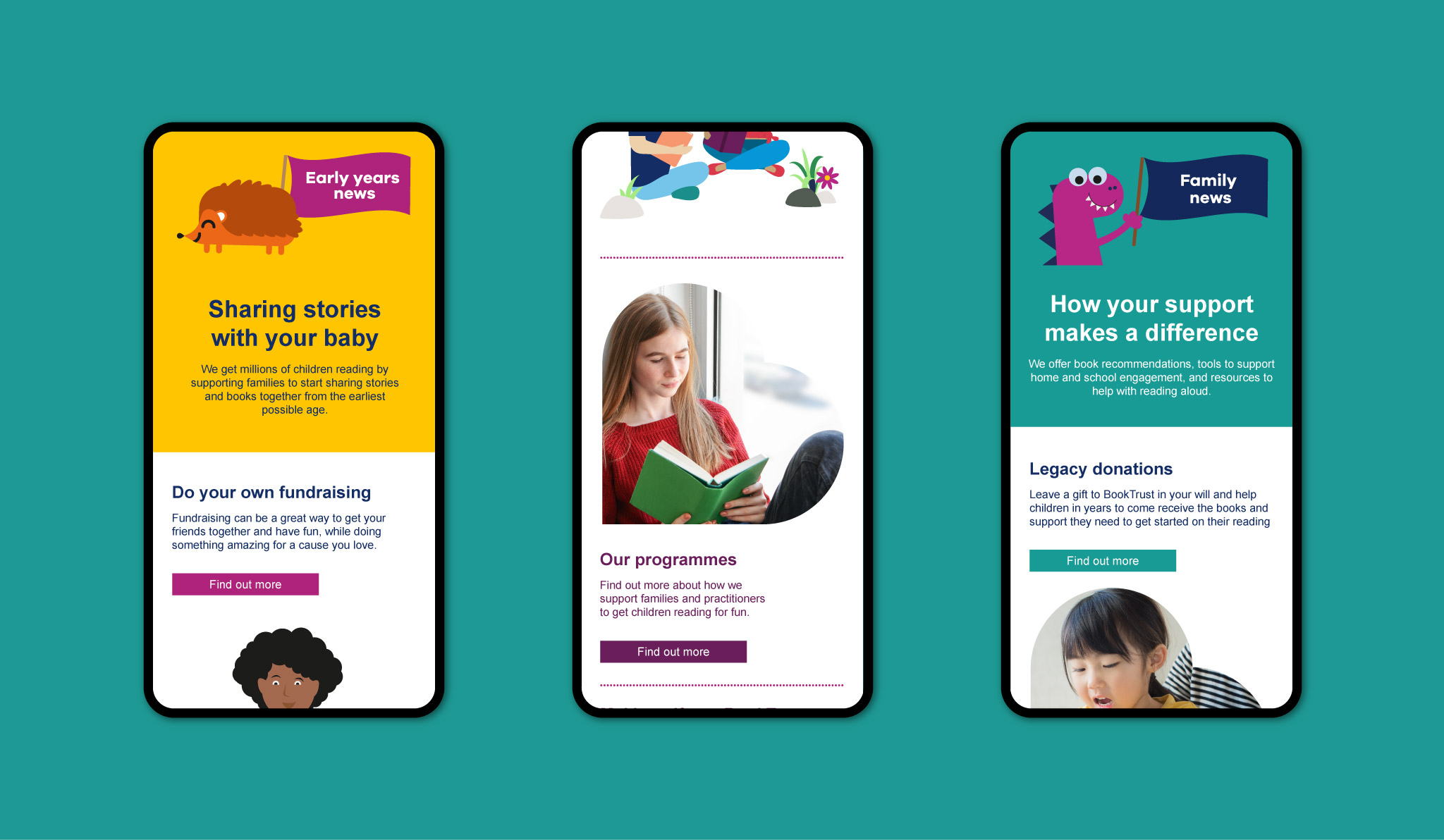
We created accessible templates for BookTrust’s team to run with, empowering them to use their brand refresh confidently and independently. Briefing out work to other teams as well as creating much of it in-house. This included templates for their newsletters and key yearly campaign packs and letters like Time To Read and Bookstart Baby.
Transforming their world
Commissioned to refresh BookTrust’s office interiors, we aimed to add some fun and spirit to the space, while reflecting the charity’s personality and values. Based around the idea of ‘Wander into our world’, we created a continuous line that runs through their meeting rooms and communal areas, interacting with various fixed elements within the space.
Each meeting room explores a different book theme, with illustrations taking visitors on a journey through fantasies, into outer space, and off into the wilderness. Along the way, we incorporated quotes from authors and parents, as well as physical frames that enable BookTrust to freshen up the content and keep the spaces feeling relevant and up-to-date.

The guidelines had been in place for five years and the brand had evolved during that time and they needed to be more in line with the direction of the charity. Studio Noel took the time to understand the project in detail, provide suggestions and challenge us where necessary.

Related projects
Growing Up in Orkney
A website to support young people growing up in Orkney
Booktrust
Campaigns to encourage children and families to make time for reading