Kwalee
One billion games installed worldwide, and one of the global leaders in casual and hyper-casual gaming: Kwalee have seen a huge amount of success in the competitive, fast-paced world of games publishing. With achievements this great, Kwalee needed a brand that stepped up to the plate and broadcast their expertise loud and proud, attracting not only new clients, but new employees to expand the business and drive it forward.
Strategy + Branding + Guidelines + Storyboarding
A new strategy for a new direction
With a new strategy in place, Kwalee had a new journey on the horizon, and they came to us for a brand refresh. They had a new tagline, a mission to guide them forward, so they needed a visual tone of voice to match their renewed, focussed direction.
Part of this strategy was to attract the very best talent the industry has to offer, meaning our brand refresh had to work on several levels, not only as a customer- and client-facing brand, but also as an employer brand, too.
So, we had to get to know Kwalee ourselves. We started first by playing their games, going on to analyse their audiences and dig into what made their global teams stand out from the crowd.
Working with an established brand
As an established global company, Kwalee’s logo was trademarked. So, we had to balance the cost and value of retrademarking the logo, and ultimately we stayed true to the original — a simple but striking handprint leading the company name.
So, while we had space to refresh Kwalee’s identity as a whole, our challenge was integrating their existing logo into their bold new look. We did this by using the mark’s essence, the hand, as the driving force, and starting point for our creative concepts.
Architecture primed for future growth
Part of this brand refresh included developing logos for the numerous verticals that make up Kwalee’s business, including casual, hybridcasual, and hyper-casual games, to PC and console gaming and publishing. This development was part of a simple brand architecture model that would allow Kwalee to set up new verticals with ease during future growth. Each unique logo gave its vertical a distinct identity and clearly organised the diverse array of projects Kwalee champions.
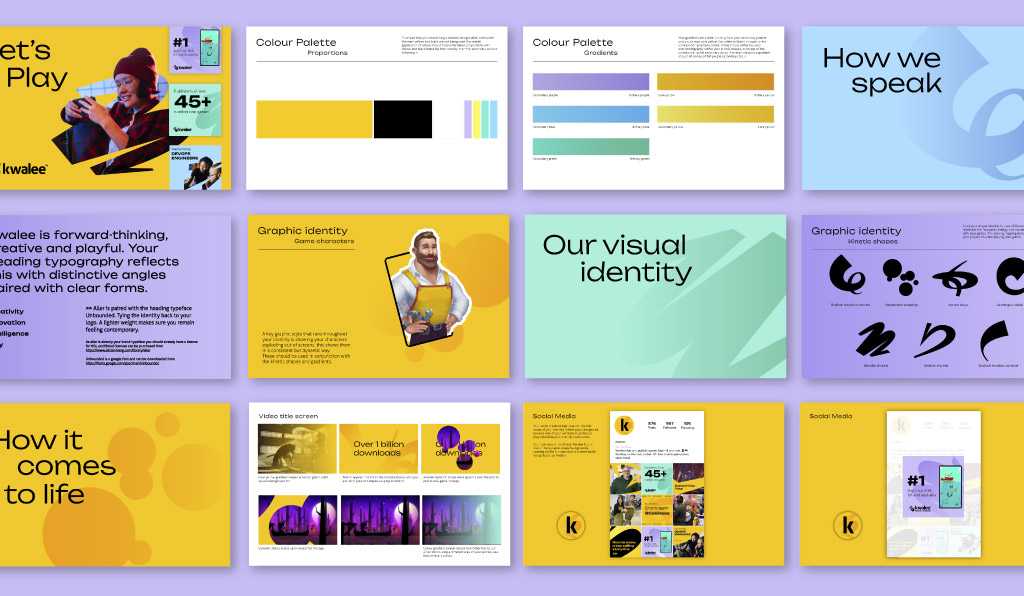
A gesture for all players
Next came the visual concept that centred Kwalee’s all important players, both the end users playing their client’s games, and the players inside Kwalee. This concept grew from the brand’s new strategy and their tagline, Let’s Play. It creates a dynamic feeling identity that is infused with all the excitement that Kwalee’s games create.
We brought this concept to life with kinetic shapes full of the excitement and energy of Kwalee games, recognisable as the gestures and movements players employ during gameplay. We represented gestures innate to all kinds of gaming platforms, from swiping and circling on mobile devices to tapping on PC and body movements on Switch. With each shape we put the gamers’ experience at the heart of Kwalee’s new identity.
Kwalee’s distinctive yellow and black colour palette is well-known amongst its clients, so we kept it in place as the base of the brand refresh. To give the palette a contemporary boost, we added a suite of secondary colours, which injected the brand with a playful tone reflective of its new strategy, plus some important flexibility for implementing the brand across multiple channels.

Studio Noel have been brilliant at revitalising the Kwalee brand - they took us from having ill-defined brand structure to a full architecture to power growth in our business...
They built us a well thought out suite of logos, colours, shapes and typography that represents authentically our brand and mission of making the most fun games for the world's players.

Capturing Kwalee in motion
Kwalee is a brand deeply embedded in a digital world. As such, it was important for Kwalee’s refresh to show how the brand came to life through movement. Our kinetic, gesture-inspired shapes were the perfect candidates for animation, and we produced storyboards detailing how Kwalee’s fresh new identity would move in videos showcasing their work.
Overall, Kwalee’s brand refresh brought an industry-leading game development company front and centre with a bold and bright new identity prepped to attract clients and customers. With all the excitement built in, the new identity made sure that Kwalee would also appeal to the industry’s top talent, as The place to work in the industry, helping Kwalee to grow their vision into the future.
Related projects
SLX
Rebranding a technical lighting and events company to drive growth
Growing Up in Orkney
A website to support young people growing up in Orkney