Equine Fitters Council
The Equine Fitters Council is the gold standard for equine fitting in the UK, ensuring the highest level of professionalism and expertise in the industry. As the leading authority, they set and uphold the best practices that keep both horses and riders performing at their best. They needed their brand identity to command authority and instil confidence in their new audience. Clearly conveying that their place as the authority on equine fitting had been earned, whilst also offering a welcoming hand. Furthermore, its website needed to actively support the Council in achieving its ultimate goal: improving equine welfare.
Strategy + Branding + Website Design + Digital
Making strong values into a robust strategy
Starting out as a new organisation with robust values, the Equine Fitters Council needed a clear brand proposition that answered the key questions of who they are, what they believe in, and how they interact with their audience. The Council was founded by two livery companies: The Worshipful Company of Saddlers and The Worshipful Company of Loriners. Both councils’ members hold strong values and are deeply immersed in philanthropic work, but each council is unique in its own way. We had to align them both in this new, unified council, and to do this, we ran brand strategy workshops to forge a strong proposition that upheld everyone’s values.
What bound these councils together was their focus on the improvement of equine welfare and their desire to create a space for horse owners and professionals to meet highly skilled, certified equine fitters. This was to become The Equine Fitters Directory, a key part of our initial strategic work on brand architecture.
We worked with the council to develop brand architecture for this directory that would balance cohesion with preserving the distinctions between the two entities.
Authority and modernity from day one
The Equine Fitters Council is a coming together of the finest specialists across the equestrian livery companies, and its identity needed to reflect their authority and knowledge. We also needed to make sure the brand was an approachable face for the industry and their message was accessible to a wide audience.
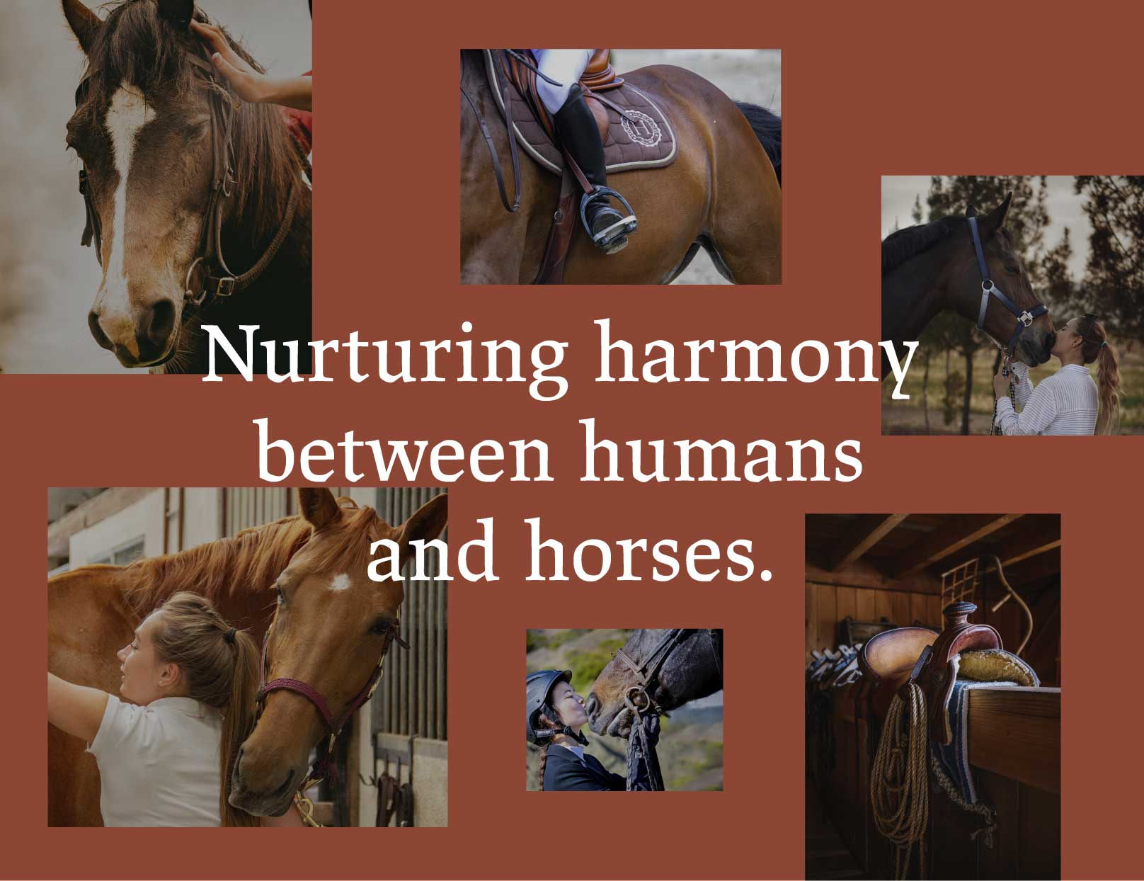
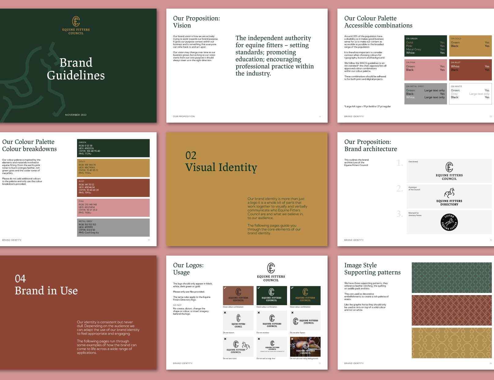
In order to do this, we balanced traditional and contemporary visual elements, affording the brand the prestige that comes with a historical council while ensuring it conveys its relevance in the modern world. We looked to the materials of the equine world to inform the colour palette, with the warm colour palette referencing the earthy tones of wood and leather paired with the metallic greys and the green of the great outdoors. The deeper tones in the palette mixed with hints of gold nod to the council’s long history and esteemed heritage.
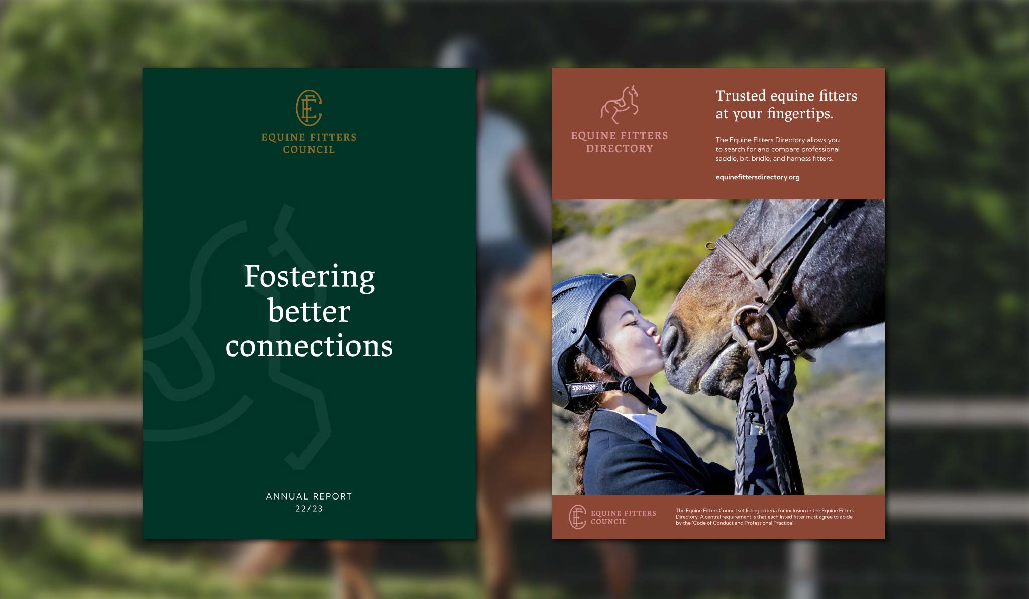
A leaping horse succinctly ties the two council’s heritages together, conveying equine strength and wellbeing in a powerful and spirited logo that sits above the wordmark. This image references the classical emblems of livery companies, cementing the councils’ passion for equine standards in their history.
The kite mark we designed is a stamp-like emblem of quality assurance that the council can issue to all of its approved directory listees. Anyone listed in the directory can use it to show their relation to the Council, and its palette of deep green and gold imparts a sense of distinction and quality for all to see.
Building the go-to resource
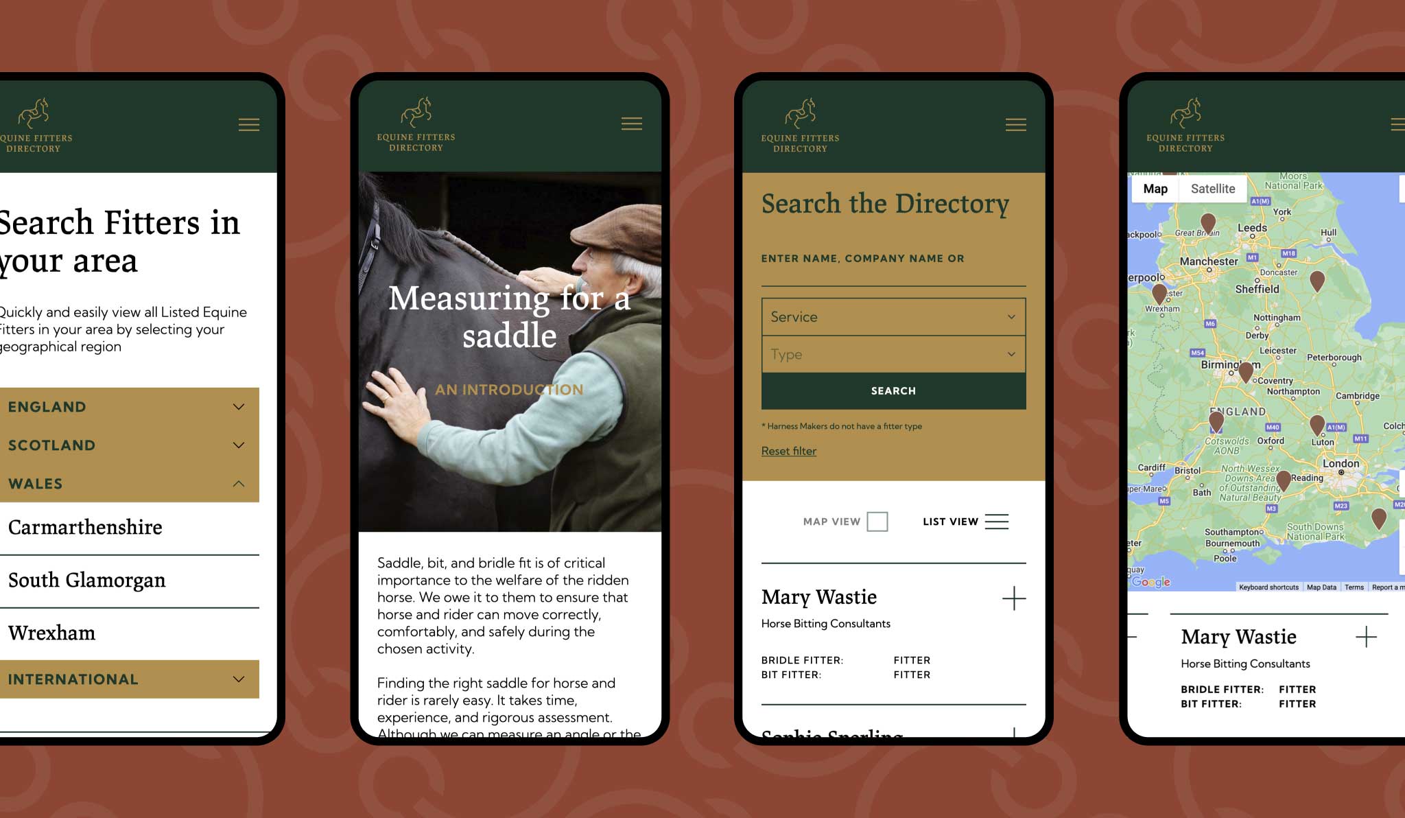
The directory is the Council’s main offering, the go-to resource for anyone visiting the website. It had to be easily accessible for visitors of any kind and deliver a lot of information. The focus being on fitters’ specialisms qualifications and importantly, locations. But the wider site also needed to be a resource for information on fitting, horse care, and equipment. For the directory listees, it needed to showcase their talent, expertise, and qualifications, and of course: they had to be easy to find. For the council itself, it needed to promote their services and encourage new members to sign up.
To make all this happen, in-depth competitor and keyword analysis was essential. With a strong SEO strategy, we could pinpoint exactly what the directory’s various audiences were looking for. This research went on to inform the site structure and optimise the user journey and strengthened the website’s potential for lucrative search engine performance.
As an organisation that represents an industry of talented people, the user experience had to sit at the heart of everything we did. We took on extensive user journey mapping to understand how the Council’s audience would use the site, from the exclusive area for listees and the membership sign up process, to the public-facing facet of the website.
We built an automated application system that allowed new listees to easily apply for memberships and make payments. For this, we used a payment gateway API that was seamlessly integrated into the site.
With so much information on the website about its qualified fitters, the public-facing directory had to be easy to search for users of all kinds. To guarantee this, we created a search function that worked with various themes, qualifications, specialisms, and locations, including a ‘find a fitter near me’ function.
We made managing the website as easy as using it with our visual, module-based CMS. Allowing the council to concentrate on the quality content that they would be regularly updating their site with, rather than tricky WYSIWYG builders.

Working with Studio Noel - Michelle and her team - is a pleasure. They involved and consulted us throughout the process of creating just the right visual and tonal branding for our organisation - and a complex website - and were excellent project managers ensuring milestones were met.

A branding suite for future success
We were dedicated to setting up the Equine Fitters Council up for success, making sure their debut as a prestigious new governing body made a big impact in the equine industry. With comprehensive brand guidelines and easy to use Canva templates, the Council now has all the resources it needs to carry the brand effortlessly into the future and onto the busy platforms of social media. This included guides for listees when using the Council’s kite mark so that its integrity remained intact wherever it is used.
Related projects
Arthur Beale
Branding a bright future for a historic sailing brand
The Worshipful Company of Saddlers
Redefining one of London’s oldest livery companies