ARTHUR BEALE
Arthur Beale is a maritime heritage brand in the UK with over 500 years of history. Known as a chandler, over all those years, they have provided the world’s greatest explorers from Shackleton and beyond with the highest quality kit. Moving from their historic Shaftesbury Avenue base, Arthur Beale was in want of a new brand identity that made it relevant for a modern audience while retaining its all-important adventuring spirit.
Branding + Products + Packaging
Making contemporary history
Although Arthur Beale enjoys longstanding relationships with a range of customers, the modern retail market calls for up-to-date identities that are ready to compete. Our challenge was to bring a historic brand into the modern day without losing any of its heritage or charm — or its loyal customer base.
To achieve this crucial balance, we made sure to bring as much of Arthur Beale’s rich history as possible into the branding, both visually and in its brand purpose, to guide it through its new ventures. We let its heritage breathe and speak to both younger and older audiences who seek adventure and quality craftsmanship, and capture the thrill of adventure, all supported by the experience of storied experts.
A new logo for a new era
Arthur Beale’s new logo needed to be as recognisable as the explorers it’s supported across time. Taking inspiration from their riveting archive, we developed a logo that conveyed reliability, strength, and reassurance, qualities all knowledgeable guides possess. We have retained the spirit of their original boat logo in a new iteration with stronger presence.
It’s a versatile logo, which we built out into a roundel stamp for use across its well-loved product range as a mark of quality. This sets its products apart for the new generation of explorers looking for the very best equipment.
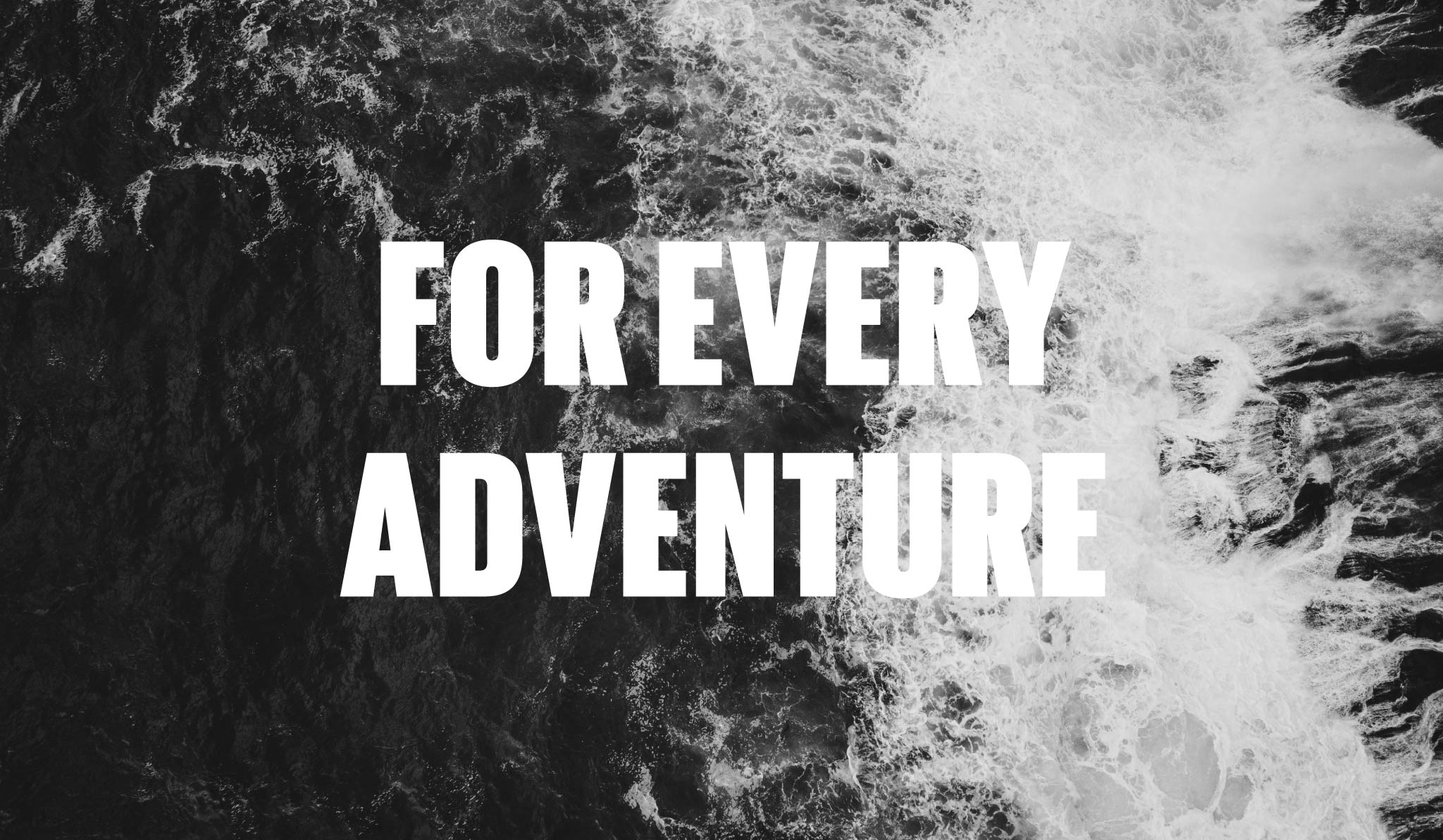
Encapsulating purpose in one line
“For every adventure.” This became Arthur Beale’s new strapline; a simple statement that summed up the company as a whole. With their offering ranging from lighthearted nautical gifts to super specialised equipment, “For every adventure” tells customers Arthur Beale will be there. This single sentence speaks of the company’s long, illustrious history, its unmatched expertise, and inexhaustible desire for exploration and adventure.
Bringing the past, present, and purpose together
We paired Arthur Beale’s past with their future with contrasting rounded serif typefaces with bold and punchy text, and classical nautical colours with a suite of contemporary icons. This gave the identity an edge that would keep up with the competing brands in the market.
Finding the spirit of the brand in photography
The best photography captures the spirit and drama of adventure. To truly give customers a sense of the environment Arthur Beale was forged in, we selected a photography style to represent the brand. We used black and white imagery of epic seascapes and coastlines imbued with a timeless appeal with a spike of raw excitement for a younger audience. Each image brings the poetry of the outdoors front of mind, attaching a sense of wonder and excitement to everything Arthur Beale offers. And, pairing them with Arthur Beale’s bold typography evokes the power of the sea and shows customers that every Arthur Beale product can stand up to the most rugged environment.
Versatile branding for diverse products
Arthur Beale has an established range of own-brand products, and we rolled out the new branding across the range. This included classic woollen jumpers and knitted beanie hats, and gifts like the brand’s practical book “A Knot a Day,” which shows people how to complete the most common nautical knots in an accessible way. The Arthur Beale brand took well to every product type, proving itself versatile and ownable.
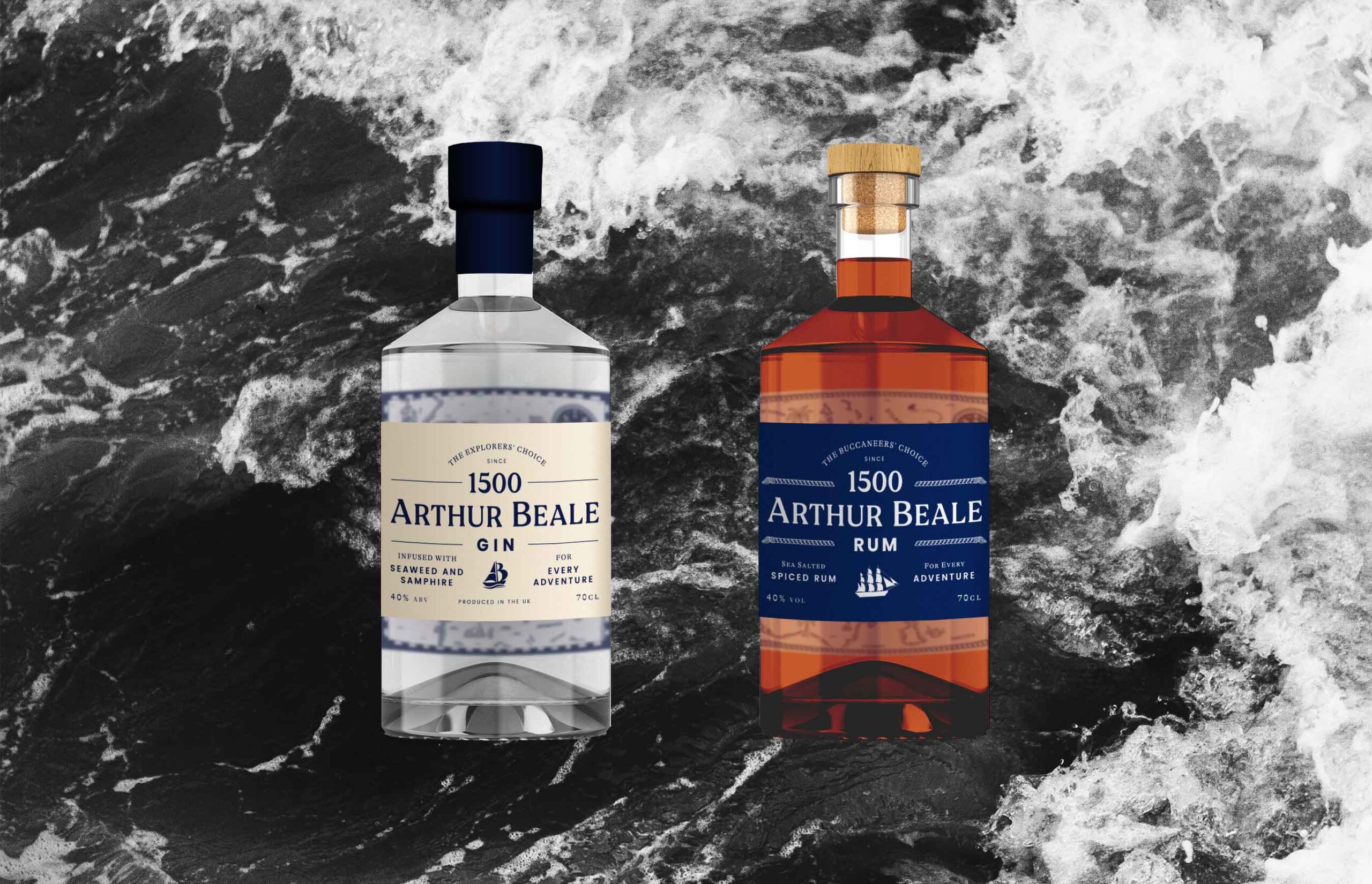
Bottle and label designs for classic sailing drinks
We also designed packaging for the launch of Arthur Beale’s very own gin and rum range. Each classic sailing drink is infused with marine flavours like samphire and sea salt, and we harked back to the company’s heritage with every bottle.
We included detailed, illustrated maps on inside-back packaging, which brought an element of storytelling to every bottle with illustrated sharks, whales, and kegs of rum and sugar cane. Gradually revealed as the drinks were enjoyed. For the gin, we took inspiration from Shackleton’s explorations, and for the rum, we depicted the Caribbean seas where the company sources the dark rum from.

I have used Michelle and her team to do two rebrands for two different businesses over the last seven years. She has done and continues to do an exceptional job.

Related projects
Swan, Shakespeare’s Globe Theatre
Redefining a landmark restaurant with a real sense of theatre
The Worshipful Company of Saddlers
Redefining one of London’s oldest livery companies