Principles of accessibility: Everything you need to know
Web accessibility helps people with disabilities perceive, navigate, and interact with the web and is essential to branding and marketing. Simply put, it means making content accessible to people of all abilities, including those with disabilities such as physical, visual, hearing, or cognitive disabilities.
It’s about ensuring everyone can access information and experiences regardless of their circumstances. As well as positively impacting customers, web accessibility significantly impacts businesses. Ultimately, a brand is more likely to succeed if more people have access to their business. It’s that simple.
While laws are in place to assist people with disabilities, simple and effective designs are beneficial for all users. After all, who doesn’t enjoy smooth and straightforward content? Increasingly, brands and businesses are integrating it into their design strategies rather than treating it as an afterthought, which significantly benefits everyone.
There are a few key principles businesses and brands should adhere to in order to meet accessibility standards and create inclusive digital spaces. Here, we’ll take a look at the key principles of accessibility in order to break down discriminatory barriers and empower brands to create inclusively.
From POUR to WCAG, we’re here to equip you with the knowledge and practical skills you need to advance accessibility and universal design. Let’s dive in.
What are the four principles of accessibility?
Essentially, accessible design is just good design: effective, highly usable visuals and interfaces. The key to good design? Content that takes specific audience members’ limitations into account—which is where the POUR principles come in.
The POUR principles were developed for web accessibility, but they can be applied to almost any accessibility issue. These are the four guiding principles upon which the WCAG (web content accessibility guidelines) was built. What does the acronym POUR stand for? Let’s get into it:
Perceivable
Your website content should be visible to all users and easily readable. You should ensure that your information and user interface components are presented in a way that is easy to understand. Regardless of whether your users have visual, auditory, or tactile senses, your users should be able to understand the information as well as the operation of the user interface.
Access to your digital platforms will be made easier by removing any barriers and offering alternative access methods for users who may have limited senses or the loss of one or more of them. This includes:
- Providing text alternatives (alt text) for any non-text content through using things like captions, large print, braille, sign language, and symbols for users with low vision.
- Providing transcripts for audio files
- Writing captions and other alternatives for multimedia content
- Adding text in HTML rather than CSS
- Making it easier for users to see and hear content, being purposeful with your use of colour, contrast, text size and audio controls
Operable
The interface components and navigation components of your website should be easy for everyone to use, including those who don’t use a standard keyboard and mouse. This includes:
- Not designing content in a way that could cause seizures.
- Ensuring responsive layouts and structures are keyboard accessible.
- Providing multiple ways to interact with your website.
- Ensuring that your content appears and operates in predictable ways.
- Providing users with enough time to use and read the content, and allowing user control over timing and time limits.
- Making your interfaces easy to navigate, ensuring content is easy to find.
Understandable
Web content should be easy to understand, easy to navigate, and easy to access regardless of the user’s ability. An understandable website has the following features:
- Appropriate language and reading level
- Providing definitions for any unusual words, phrases, idioms, and abbreviations
- Supplementary representation of information, such as:
- Summaries ahead of long articles
- Written descriptions for visual information in charts or graphics
- Transcripts for video or audio files
- Ensuring that headings, lists, tables, input fields, and content structures are marked up properly
- Consistent font styles (families, colours, sizes) across all pages
- A simple navigation structure
Robust
Your website or app should be compatible with and easily interpreted by a wide range of user agents, including assistive technologies such as screen readers. For your website to be robust, you should:
- Support some outdated versions of the operating system and browser, since older users and those who use assistive technology are less likely to have the most current versions.
- As much as possible, ensure compatibility with current and future devices, operating systems, and browsers.
- Make sure the platform you are using conforms to any applicable technical standards.
What are the elements of accessibility?
Understanding perception, vision, and colour is critical when designing visual and readable content for sighted users. The understanding of these concepts is essential for all sighted users, but it is especially useful to those with reduced vision and colour deficiency and also to those with certain neurological, cognitive, and other impairments.
It’s important to understand who your users are and what problem you’re trying to solve for them. This will help you determine what accessibility issues to consider and why, which is why user research is crucial when designing and developing a website.
There are three pillars:
1. Complexity
Your website needs to be perceivable, which means you must take into account how complex your website is. When asking your users to fill out a form, why not offer a single field with input assistance instead of multiple fields? Your customers and users will be able to use your channels more easily with systems that make life easier for them. Your job is to help users access your content.
In brief, accessible websites aren’t complex and offer intuitive interactions. You should consider:
- Providing clear explanations of the purpose or destination of links, buttons, and menu items.
- The visual indicators of interactive elements (links, buttons) should be clear and consistent. Using trial-and-error should not be required for users.
- Make field labels and related elements as visible as possible.
- Having large touch targets, a space between interactive elements, and a clear mouse path will make hovering and clicking more forgiving.
- Each page’s navigational elements should appear in the same location and order on each page, and the active page or section should be identified.
- If users cannot find what they are looking for in the main menu, a site search, content links, a site map, or similar alternate navigation should be available.
2. Vision
Take into consideration how your website can be viewed and operated. Getting away from your screen, even a few steps, or removing your glasses, is a helpful way to understand if you can recognise each element on your webpage. Take a look at your elements and determine if they are always distinguishable and recognisable.
- Designs must be adaptable to a variety of screen sizes:
- A small screen should not be overfilled with elements or too small to read.
- Elements on large screens shouldn’t become blurry due to over-enlargement.
- Designs shouldn’t require a particular orientation (vertical or horizontal).
- A design should be adaptable to low and high pixel densities:
- Low PPI screens may require heavier fonts or simplified graphics.
- It is necessary to use vector or high-resolution images and logos for screens with high PPI.
- Users should be able to focus on the primary content without distractions.
- Grouped elements should be separated by ample space.
- Minimising or pausing animations should be easy.
- It is generally easier to read sans-serif fonts with line heights (leading) closer to 1.5 and line lengths less than 80 characters.
3. Colours
Accessible design relies heavily on colour. For some users, oversaturated colours, strong contrasts, or even yellow alone can be uncomfortable.
Poor contrast between foreground and background colours makes it difficult for users with low vision, those using low-end monitors, or those in direct sunlight to see. Your website must be accessible in terms of colour, and here’s what you need to do:
- The contrast between text and its background should meet WCAG 2.2 standards: 4.5:1 for small text and 3:1 for large text.
- The contrast between meaningful graphical elements (icons, focus indicators) and their backgrounds should also be 3:1.
- It is best to avoid using pure black (#000) against pure white (#FFF). For many users, especially those with dyslexia and light sensitivity, extreme contrast at a single pixel distance reduces legibility and increases eye strain.
- Try to use palettes which remain distinct for colourblind users when using multiple thematic colours.
- Don’t rely solely on colour to convey concepts. Elements may need secondary indications such as icons, underlines, or contrast changes.
- Use Studio Noel’s colour contrast checker to ensure that the colours you want to use meet the WCAG 2.2 standards for Level AA and AAA accessibility.
What is universal design?
Universal design aims to make all things—from architecture and products to websites and content—accessible and usable for as many people as possible, regardless of their age, abilities, or circumstances. Essentially, it’s about designing things that work well for everyone, no matter who they are, where they live, or what impairments they might have.
The goal? To create a world where everyone can participate fully without barriers or limitations. Rather than a nice-to-have, universality is the cornerstone of good design. Not only does it address the diverse needs and abilities of a range of people, but ensures that everyone can enjoy your product or service. Chiefly, it’s a smart and thoughtful approach that recognises diversity and inclusivity as strengths, not just checkboxes to be ticked off.
What are Web Content Accessibility Guidelines (WCAG)?
WCAG is a worldwide International Standards Organisation standard that tests and implements accessible user experiences for people with disabilities. You can use it as a web framework for desktops, mobile web, native apps, and pretty much any type of digital content.
Web content can be made more accessible to people with a variety of disabilities by following the guidelines of WCAG 2.0, WCAG 2.1, and the newest version, WCAG 2.2. This new version also includes new Success Criteria at the A / AA / AAA levels, which primarily address user needs in Mobile Accessibility, Low Vision, and Cognitive function.
Making your website accessible and WCAG-compliant is wise, even though it’s not legally required for all businesses. Although, customers will be more likely to return to your site if you create a memorable and positive UX.
The WCAG have a brilliant checklist you can use to ensure you’re designing accessibly. But, to get you started, we’ve put together a little cheat sheet to set you on the right track:
- Choose a content management system (CMS) that supports accessibility standards. Always make sure pre-used templates are accessible.
- Create personas with varying abilities.
- Use header tags in text.
- Use alt text on content-enhancing images.
- Have a link strategy, offer visual cues, underline links, and highlight menu links.
- Enhance visibility by carefully selecting colours and ensuring that they are high contrast.
- Guide users with reference shapes (e.g. click the square button).
- Take into account how screen readers handle forms. With tags, you can label fields and give descriptions to screen readers.
- Lists should use the correct HTML elements and avoid putting them on the same line as the text.
- Dynamic content, such as slideshows, should be presented with care.
- Make sure your markup can be read by all browsers using the W3 standards site.
- Provide transcriptions for audio resources and captions or subtitles for videos.
- Content should be easily understandable: simpler language, an effective information hierarchy, progressive disclosures, and prompts can help you reach more users.
- Put your design to the test without a mouse.
- You can test your design’s accessibility with tools such as WAVE and Colour Oracle.
What is the difference between the WCAG 2.0 and the DDA?
WCAG 2.0 (Web Content Accessibility Guidelines 2.0) and DDA (Disability Discrimination Act) are both important tools and while they’re similar, they are by no means are they to be confused.
As mentioned above, WCAG guidelines are an international, globally recognised set of guidelines providing a comprehensive framework for making web content more accessible to people with disabilities. Chiefly, WCAG 2.0 is a regulation, often recognised as best practice in web development, not a law. That means there’s nothing legally binding you to WCAG compliance.
On the other hand, the DDA is a piece of UK-specific legislation and legal requirement that addresses discrimination against people with disabilities in various contexts, including the provision of goods, services, and facilities, including websites. The DDA requires service providers, including website owners, to make reasonable adjustments to ensure that their services are accessible to all people. While the DDA applies to web usability, it is a specific law in the UK, and its requirements may differ from other countries’ laws and guidelines.
Quick answers to your accessibility questions
How can I make my website more accessible to people with disabilities?
Five things you can do to make your website more accessible include:
1. Think about colour: Take time picking colours that make your content easy to read and understand.
2. Write with simplicity in mind: Use simple language and guide the reader through your content with prompts and descriptors like ‘click the square button to learn more.’
3. Use tags: Tagging headers means screen readers can understand the structure of your content, and users can navigate it more easily.
4. Dig into your HTML: Screen readers will read HTML tags and tell users exactly what’s on the page and what it does so they can use your site with confidence.
5. Use alt text: Alt text describes an image so people can still enjoy visuals and experience your content to the full.
Can visually impaired people use a screen reader to access the content on my website?
If you’re creating simple content, organising it under clearly labelled headings, adding alt text to every image, making the page navigable with keyboard commands, and using HTML that will make the function of every element on your page clear to visitors, then yes! People with low vision should be able to access your content with ease.
We can help advance your accessibility and universal design
Making your site accessible simply means doing the right thing for those who matter most to your business—your visitors and customers.
We strive to make brands accessible to all and would love to assist you in cultivating inclusive content. If you need help with kickstarting your accessibility journey, get in touch.
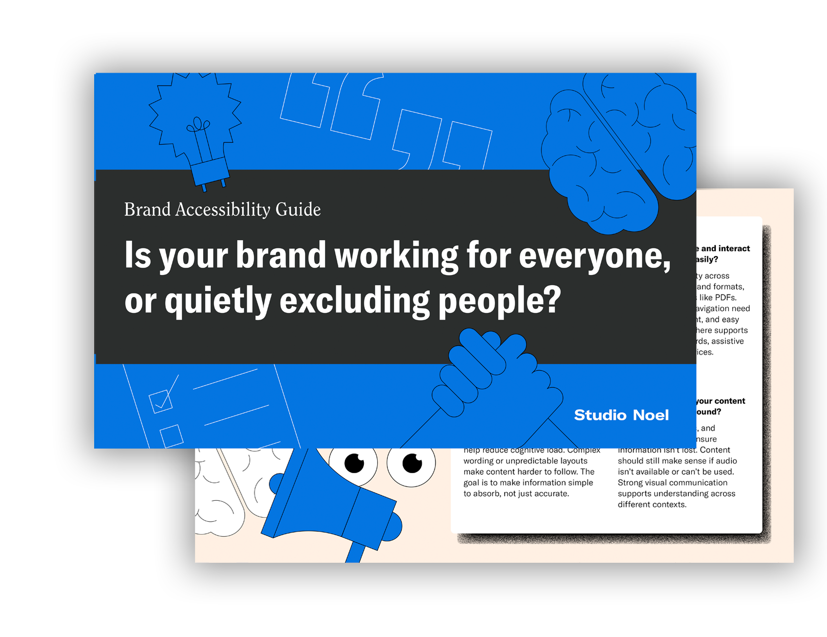
Increase your brand's reach by downloading our PDF guide on Brand Accessibility and learn how it can positively impact your business.
Download guide