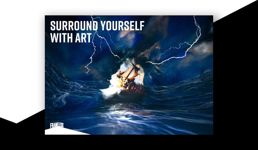
Immersive Galleries
Seeing art is more than peering at a canvas on a wall, and Immersive Galleries are experts in shaking off the traditional gallery format and pushing the experience far beyond the expected. After the sweeping success of their touring exhibition, Van Gogh Live, Frameless is the company’s first foray into making immersive art a permanent fixture in a Marble Arch gallery. They wanted to capture their audience’s imagination during and after their visit, so they came to us to help them create an inspiring product line for their gift shop that reinvented the artworks on display.
Packaging + Products + Print + Editorial
How do you capture an ever changing artwork
The four main galleries in Frameless each reinterpret an art movement, from The Art of Abstraction, Beyond Reality, and Colour in Motion, to The World Around Us. The products, which included brochures, sketchbooks, confectionery, and biscuit tins, needed to reference and represent the vast array of art in the gallery. But how could we translate an ever-changing, moving, interactive exhibition onto static products in people’s hands?
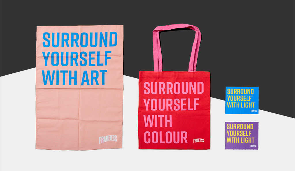
Balancing audience desires with the Frameless identity was key across the product ranges. Situated a few steps away from Hyde Park, Frameless is in a key spot to attract tourists. So it was key that each product had souvenir appeal, encapsulating the visitors’ experience — and Frameless’ bold and punchy identity — while also appealing to the broad range of people that would pass through the space.
A concept reimagined
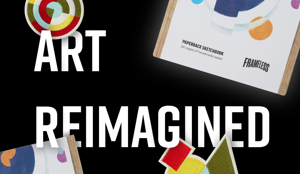
Frameless’ core concept, ‘Art Reimagined’, questions how people can view, feel, and interact with their favourite art. We stood by this core concept to reimagine Frameless’ work ourselves: we had to take beloved artwork that was now moving, shifting, and changing, and rework it into special, giftable items. Naturally, we had a lot of visual inspiration to work with, and we isolated elements of certain artworks and evoked the visual effects of the mesmerising projections in the gallery.
For the gallery’s launch, we created ranges of stationary, art materials, homeware, and gifts including confectionary and fabric patches, all imbued with the spirit of the artworks in the gallery.
Fine art in motion
In the Colour in Motion gallery, a pointillist artwork dissolves across the floor and walls, and viewers can connect with the moment and move dots with their own body, creating their own artwork as they go.
This was a moment that would stick in visitors’ minds, and we used it as a starting point to create bespoke illustrations for a set of high quality art materials. Not only does it reference a beautiful interactive moment in the exhibition, it speaks to the types of marks people can experiment with on the paper, reminding them of the art they helped create in the gallery, too.
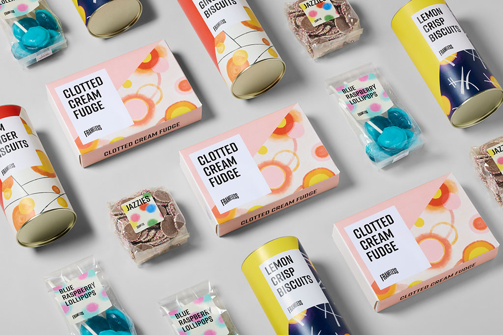
A sweet take on abstraction
The Art of Abstraction gallery pulls apart famous abstract pieces and animates them, creating a layered experience where fragments of each artwork float in space. It was this experience that inspired our confectionary packaging. Balancing the conceptual with the flavourful, we took shapes inspired by art movements and created dynamic patterns with a handcrafted finish.
A key element within the Frameless identity was their bold angle that spoke of the three dimensional space the new artworks inhabit. This angle was brought directly onto the confectionary packaging, creating something bold and exciting to contrast the artistic, abstract patterns; a design that worked for the broad audience.
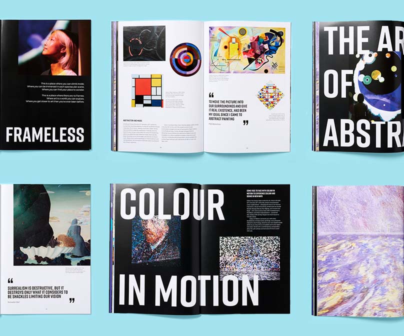
Owning the experience with a souvenir brochure
The souvenir brochure was one of the standout pieces from the collection. It’s a product that features beautiful imagery of the gallery spaces themselves, acting as a way to take a piece of the gallery home.
Because the gallery experience itself is miles away from reading small captions on a wall, the brochure acts as a place to find out more about the history behind the artworks and movements and make connections with the immersive experience they had. It features large scale images of the gallery and detailed histories of the artists’ lives, bringing each art movement to life in exciting ways.
We paired the bold typography from the Frameless identity with imagery from the gallery to create layouts that had a sense of suspension, referencing the dynamic, fluid, and layered exhibition on each page. The result was a luxurious memento of the gallery experience.
Making art accessible for young minds
Frameless knows that art isn’t just for adults, and we recognised that the gallery was a space for children to dive into the magic of art. To make sure children could get involved and thoroughly immersed, we developed activity packs that brought the various art movements in each gallery back to life. One such activity was Abstraction, looking at how abstract artists used shape and colour to explore feelings. Our activity got children to experiment by colouring in abstract shapes in a way that reflected their mood, considering how colour is intertwined with emotion. Each activity was crafted in-house and illustrated, and aimed to ignite the imagination and curiosity of the gallery’s younger visitors.

It was terrific working with Studio Noel across multiple product categories, including the Frameless Guide Book. Lots of the products within the range have become bestselling items.

Related projects
Swan, Shakespeare’s Globe Theatre
Redefining a landmark restaurant with a real sense of theatre
Centrepoint
Creating greater brand reach through accessible design