Weaving brand personality across every touchpoint with Bunk
Hostel chain Bunk in Amsterdam and Utrecht are all about the experience and, as hostels go, they are pretty unique. To say they have quirky interiors would be an understatement – a purple dinosaur (not Barney) being a highlight but despite their quirky nature the Bunk hostels are super sleek, chic cultural spaces. You feel at once like you might get swept away with a wild party or meet a mysterious artist who will take your portrait. It’s all about creating stories at Bunk.
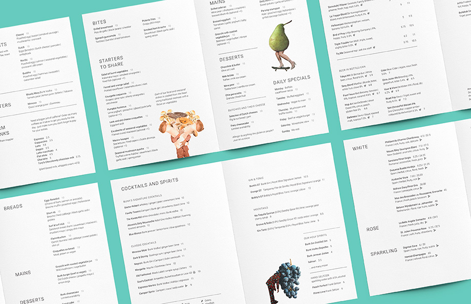
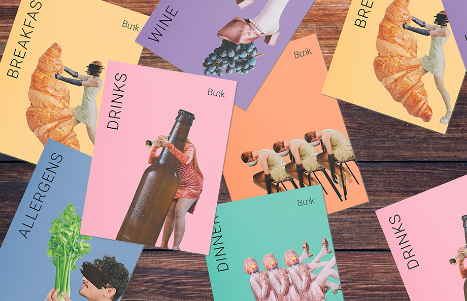
Bunk came to us to redesign their menus, moving them from a fairly standard format to stripped back menus focused on sharing plates and seasonal ingredients.
We knew we had to create something pretty special for their new menus. With such a bold character running through the rest of their identity, and visitor experience being so central to their brand, the menus needed to be part of the Bunk experience.
To bring the sense of a communal experience we created a surreal style of illustration for the Bunk brand, to act as a conversation starter. It incorporated their already existing photography with seasonal ingredients and dishes and drinks. The tone fit perfectly with the Bunk brand, quirky, arty and tongue in cheek but always with an underlying sense of sophistication.
From there we designed pared back menus that felt airy and calm, reflecting that balance between surreal humour and sophistication.