How to create a brand style guide
No matter the size or scale of your brand, a brand style guide — sometimes known as a brand kit — is essential. Whether you‘re kickstarting a new branding project, going through the rebranding process, undergoing structural changes, or run a small business, global institution, or new startup — a shiny set of brand guides is integral to your success.
When it comes to building memorable, ownable and distinct brands, consistency is key. And how do you ensure consistency? With brand style guides. They communicate the essence of your brand, and ensure cohesion throughout all brand collateral — no matter who creates it.
Whether you’re a new brand, a well-rooted industry leader, or the proprietor of your own brand, it’s imperative to have these guidelines established. They provide the foundation for upholding your brand’s design coherence across elements ranging from social media visuals to your communication style and your brand’s colour palette. In essence, these guidelines guarantee a captivating and uniform brand identity.
They’re so vital that they’re often referred to as brand bibles, but don’t let that jargon intimidate you. We’ve created this 11-step guide to give you the know-how when it comes to creating, implementing and publishing brand style guides.
So, where to begin when creating a brand style guide? Let’s get into it.
What is a brand style guide?
Brand guides communicate the heart and soul of your brand and translate it into design — reinforcing how your brand should be communicated across all channels and touchpoints at all times. And if you’re asking, what are brand identity guidelines? Are they the same as a brand style guide? Not quite. A brand style guide is where your brand identity guidelines live.
Using your brand identity as the foundation, style guides should include guidelines for all brand elements, including logo usage, colour palettes, tone of voice, typography, graphic design elements, imagery, fonts, and more.
In simpler words, think of a style guide it like a handy guide that ensures your brand looks, sounds and feels the same — everywhere and at all times. Essentially, it’s a rulebook or thorough set of brand identity guidelines that detail precisely how an organisation should present itself through its visual assets — ensuring that all brand content is on-brand and that your content creators are sending the right message, in the right way.
They’re particularly important for companies that hire a lot of freelancers, as these individuals might require direction on accurately embodying your brand. By furnishing them with a brand style guide, you not only simplify the process of them grasping and maintaining your brand essence but ensure consistent branding — within all contexts.
Consistency is key, and a brand style guide is pivotal in ensuring that your brand content is congruent across all brand elements, and instantly recognisable across all channels.
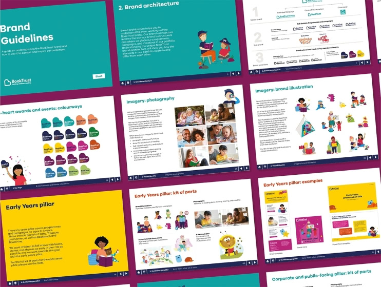
What are the components of brand style guide?
Before we go into how to create your style guide, let’s take a quick look at what goes into it.
We recommend starting off with your brand proposition, mission, or values to contextualise all the information to come.
You’ll then need to include sections on your tone of voice, logo, typography, brand colours, and examples on how people across your organisation should use each and every element. You can also include examples of how not to use your brand elements.
There should be more visual examples than text, and it should be well-organised and easy to navigate.
Now you know the broad strokes of what you need to include, read on to learn how to build your brand style guide in more detail.
Steps to creating a brand style guide
Step 1. Collate your resources
Reference points will always come in handy, so make sure to keep a track of any resources that feel on-brand. It’s a great idea to ask employees at all levels to gather and save the resources that they feel best represent your brand.
These resources will form the foundation of your brand guidelines, and will provide an invaluable insight into your employees’ brand perceptions — giving you concrete examples to define the look, feel, shape and size of your brand.
When it comes to analysing the resources collected, be sure to take notes about what you and don’t like about the resources collected (e.g. the image is on brand, but the placement isn’t right).
You should consider:
- What has or hasn’t worked for your brand in the past? Collect examples of successful advertisements, email designs, webpages, mailers etc.
- What do brand competitors or aspirational brands do that you admire?
- What questions repeatedly come up? It’s useful to keep track of recurring questions and feedback. If you notice that designers or writers keep asking for the same clarification, it might be worth adding to your guideline document.
Step 2. Choose a presentation format
You have various options when it comes to presenting your brand style guidelines to meet your needs. You have options:
- Static (Print): A physical printed book or brochure that can sit on peoples desks.
- Static (Web-page): A single page snapshot of the brand that gives an insight to all the key principals.
- Interactive (PDF): A interactive pdf is a great way to capture all your brands key components and can be saved easily on internal servers or intranets.
- Interactive (Web-pages): A website to bring your guidelines to life and portray your brands personality.
Increasingly, more and more brands choose to go digital, creating brand portals that host their guidelines. No matter which medium you opt for, it’s always wise to create a digital back up. Digital style guides, or interactive PDFs are more easily accessible than physical copies.
Step 3. Plan your guides structure
Once you’ve gathered your inspiration and decided on a presentation format, it’s time to start working with a designer to put it all together. The structure of your guide is critical to how it is understood – and followed.
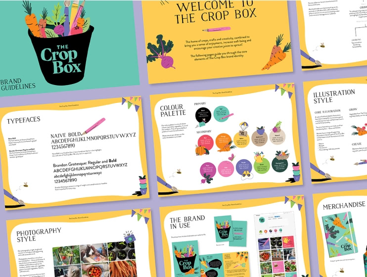
It’s important that your document is clear and easy to follow – we’d suggest following a structure like this:
Contents: Clearly outline exactly where every brand element can be found, from logo usage and other visual elements, to hex codes, your brand’s tone of voice, social media and so on.
Brand proposition: There are five key components: purpose, vision, target audience, brand personality and core values. Essentially, this is a high-level, in-depth explanation of your brand’s core principles, influencing everything from your website design, to your use of iconography. It encompasses your:
-
- Purpose: Why do you exist? How do you create that future?
- Vision: What future do you want to help create? What does the future look like?
- Values: What principles guide your behaviour?
Visual identity: This will cover everything in relation to how your brand will be visually represented, from colour choices, to your brand image, brand’s logo and so on. It will include:
-
- Logo
- Colours
- Typography
- Photography
- Illustration
- Iconography
Verbal identity: This will cover everything in relation to how you describe your products, communicate with customers, speak about your company, and so in. It will include:
-
- Voice
- Tone
- Personality
- Value proposition
- Messaging pillars/differentiators
- Tagline
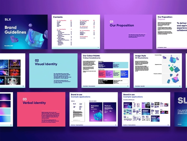
Examples of the brand in use: How should your visual and verbal identity be used across your website, brochures, social media, LinkedIn, marketing materials, emails or press releases? Providing real-life examples, will make these elements much easier to emulate.
Asset library: Also known as a brand library, digital asset library, or DAM library, this is the digital home of all your company’s or brand’s assets.
Further guidance: Whatever you think anyone needs to know – include it. What helps you, will probably help others! Do you use a specific contrast checker, or a specific tool to check your spacing? Give as much detail as needed, but keep in mind not to exhaust your reader. Outline who they can speak to for further information.
Step 4. Create a brand story
Behind every strong brand, is a compelling brand story. Your brand story should define the things that make your brand unique, and should be driven by your brand personality. Brand stories will differ depending on the size and shape of the company — but all brand stories should outline a brand’s purpose, vision, core values, and personality.
These elements should be communicated clearly and concisely — they need to be watertight, so be sure to leave no room for them to misinterpreted. Your story should communicate who you are to the public, demonstrating your values, vision and higher purpose.
Most importantly, your brand story should build connections and trust. Simple stories are universally accessible, so be sure not to complicate yours, while leaving plenty of space for your brand personality shine through. A great brand story simultaneously gives your brand roots, and secures its future.
Step 5. Outline the elements that make up your visual identity
Show people how to use your logo
Your logo is the most important part of your brand. It’s the one asset that people will immediately recognise you by, and is the most common cue-card for brand recall and brand recognition. This section of your brand style guide ensures that your logo design is always used as intended, and is never distorted or misused.
For your logo to be recognisable, it has to be consistently used, which is why your brand guidelines should outline exactly how — and how not to — use it. When dictating your logo and tagline usage, be specific about the colours, exclusion zones, minimum sizes, proportions and alignment. This not only ensures consistency across the board, but drives accurate brand representation.
Be sure to show people how to use your logo across all mediums, be it online, on business cards, emails, or so on. You should include all approved versions of your logo, outlining when to use each version, and providing visual examples to avoid confusion. It’s wise to include a list of do‘s and don’ts, outlining which logo treatments to avoid, and when.
Define your colour scheme
Establish primary and secondary colour palettes, and be sure to provide the colour breakdowns for each colour, so that they‘re replicable, and reproducible irregardless if a designer is using CMYK, RGB, HEX or Pantone. Always make sure to include print and screen/web colour equivalents.
Provide colour breakdowns and colour accessibility charts as a quick reference tool for your designers. It’s important that your style guide isn’t too text heavy, so provide colour graphs and charts to not overwhelm your readers!
Outline your font and typography
Does your brand use one typeface family, or do you need to define multiple brand fonts? Outline your primary and secondary typefaces, and specify print and digital font usage, including information on alignment, and spacing.
The right typography can enhance your brand communications, so be sure to tell the story of the typefaces you use: how they relate to your brand, their specific usages, and if they’re used for main body, headings, captions, and so on.
However straightforward your typography is to you – take care to provide clear instructions, explaining the reasons for your choices. This not only ensures correct usage – but that your decisions are understood, and therefore more easily followed.
Define your image style
Your images are one of the most powerful aspects of your brand style guide, as they evoke an emotional response, tell your story, and showcase your products and services. In this section, you should provide images for many aspects of your brand, from your website and social media, to your content marketing. It should include photography styles, composition, colour hues and so on.
Outline the different image styles for your brand, provide examples of on-brand photography, infographics, illustrations, and iconography. It’s also worth showing the types of images that you don’t like, and haven’t worked well.
If you haven’t got all of the assets to hand that you feel best define your image style, don’t shy away from creating aspirational moodboards. Showcasing imagery that convey your brand will still provide your team a sense of the style to work towards.
Step 6. Define your verbal identity
If your brand were a person, how would they speak? It’s wise to build on your brand personality – this will dictate the kind of language that feels on brand, and accurately conveys your purpose. Your brand voice should capture your brand’s personality, and should be consistently used across all of your brand’s messaging – from emails, to advertisements, to brand guides.
Each guidelines in this section should reflect a deep understanding of the purpose of the communication, and the intended audience. Your brand’s voice strongly impacts how your audience interacts with you, so it should be crafted with your target audience in mind. What language, tone and messaging will they respond to?
It’s helpful to provide copy examples, as well as a house style guide, to make sure that your verbal identity can be uniformly reproduced. Sometimes, simplicity is best, and a list of do‘s and don’ts always goes a long way – why not create a list of words that do, and don’t, aptly demonstrate your brand.
Step 7. Show examples of the brand in use
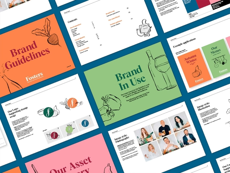
Once you‘ve fleshed out your content, you should wrap things up with example applications, showing real examples of how your identity comes to life. How should your brand voice and visual identity be used for social, business cards, brochures, signage, and product descriptions? What does your typography hierarchy look like?
Showing real-life examples makes these assets much easier to emulate. It’s one thing reading instructions on how to create something – and it’s another seeing a finished example. Physical examples are great illustrators of how your brand can be brought to life, showing content creators how all of your brand elements come together to project a strong, unified brand image.
Step 8. Point people in the direction of the asset library
Consider your asset library as your brand’s DNA. This is where your brand creators should be able to find all of your brand assets – your logo, typeface, ready-made templates and stock images that make it easy to create your brand, and consolidate brand consistency.
The very last pages in your style guide should include information or links to download your visual assets. The most common reason people don’t adhere to style guides, is because they can’t find the right source files – so make sure that your assets are easily locatable. The best brand libraries are cloud-based to provide anytime, anywhere access.
Step 9. Provide a contact for further guidance
Who manages the brand internally? Various design heads will be responsible for overseeing distinct brand elements, so be sure to point people in the right direction, tell them exactly who to go to, and how and where to reach them.
As with the rest of your document, be sure to update this in accordance with staff changes, or structural re-works.
Step 10. Review your brand guidelines and publish
The entire point of your style guide is to eliminate questions when it comes to creating your brand content. So, once everything’s been collated and pulled together – it’s a good idea to review what you have. This is your chance to catch any mistakes, and make sure everything you need is there.
It’s always a good idea to get a second pair of eyes, and we’d recommend asking someone to proof your style guide before it’s distributed. Consider sharing it with someone who isn’t familiar with your brand, to find out if:
- Is it clear, and accessible to a range of people?
- Have you missed anything?
- Are there any other additions that could improve the reader’s experience?
Before publishing – there’s one last vital thing to consider. Where are you going to publish your guidelines?
Make sure your guidelines are easy to find, and are shared with everyone – including new starters and brand partners. If you’ve opted for a print version, it might be wise to render it digitally too – to ensure no loss of assets.
Brand style guide examples
Asana
This savvy company explains the why behind their branding, to foster connection and forge brand understanding. Their logo – which comprises of three dots – champions the boundless potential of human collaboration, and visually represents a sense of clarity, balance and purpose-driven design. These drivers are consistently endorsed throughout their guide, making their brand personality easy to understand, and emulate.
Spotify
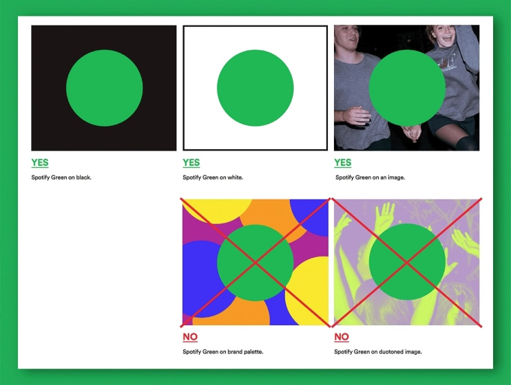
Their guidelines are expansive – and even better, they are consistently branded. In treating their guidelines as another marketing material, Spotify further enforces their visual identity, and flexes their brand unity. In their style guide, they have included realistic examples of where not to use their distinct ‘Spotify green,‘ leaving no stone unturned in how to specifically and situationally represent the brand. The guide allows you to download an icon version of its logo, making it easy to represent the brand without manually recreating it.
Formula 1
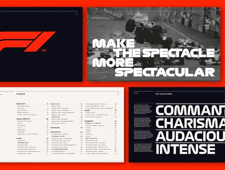
Their guidelines are visually spectacular, and their brand is embedded into every aspect – making it easy to emulate their brand style. Kicking things off with their brand strategy and story, Formula 1’s guidelines are structured in a way that’s easy to follow. Their table of contents is thorough and direct, making this vast document smooth to navigate.
Netflix
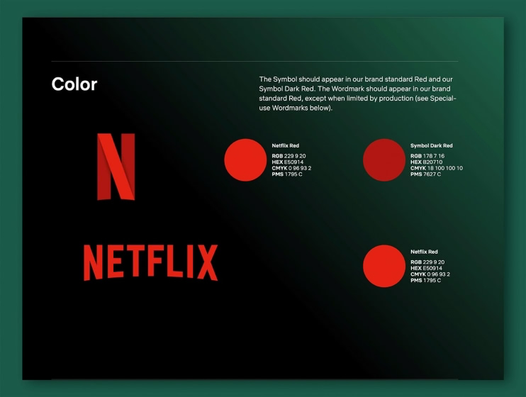
The streaming giant’s iconic ‘N’ has become synonymous with the brand. With this in mind, the companies online brand guidelines home in on this logo and symbol – going to show that brand guidelines are there to accommodate the scope of your brand.
Medium
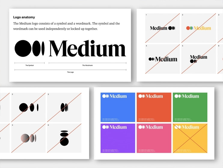
Emphasising both colour and typography, Medium’s guide also includes details relating to their purpose and product principles. Stylistically, their guide is full of visuals and examples that make their brand choices easy to understand, and emulate.
Consider going one step further and creating a brand book
Brand books are a fantastic way of engaging employees and bringing them on-board as internal brand advocates. They serve as reminders for employees in regards to company values and purpose.
Just as its important for your customers and clients to understand your brand’s purpose – your employees need to know exactly what they’re striving towards. By clarifying and communicating your brand vision, purpose and values – your employees will understand the meaning behind their work – the why, the how, and the what. In turn, this will provide a natural motivation for employees to promote your business, underpinned by a clear purpose, and your brand’s vision for the future.
While style guides are often thought of as visual-only, we recommend including elements of your brand strategy in order to help people understand the brand they working on. If you already have a mission statement or ’About Us’ description for your brand, why not start there.
Get your brand style guide started
Style guides are essential when it comes to keeping your brand identity consistent, recognisable and ownable. It’s important to spend the time and resources to get it right.
Get in touch to discuss how we can help you create a brand style guide that consolidates your purpose, communicates your essence, and propels you into the future.