Fosters
As one of the leading events and catering companies in the South West, Fosters have been turning special events into extraordinary occasions for more than 60 years. Looking to highlight their wealth of experience, deep expertise and enduring relationships, they partnered with us to redefine their strategy and reposition their branding.
Hospitality: Strategy + Branding + Website + Print + Digital + Brand guidelines
Getting to the heart of their business
To really understand Fosters and uncover what makes them unique, we began by thoroughly immersing ourselves in their world through a series of in-depth workshops, interviews, and brand and competitor audits. We dived deep into every aspect of their business – from their events, experience and knowledge, to their clients’ opinions and motivations, as well as Fosters’ exceptional food and drink offering, local suppliers and sustainability credentials.
Our research revealed that we needed to develop a brand that would capture their creativity, relationships, and the warmth and expertise of their teams. We brought it all together in a purpose driven brand idea: ‘Fostering Joy’.
Creating a joyful brand
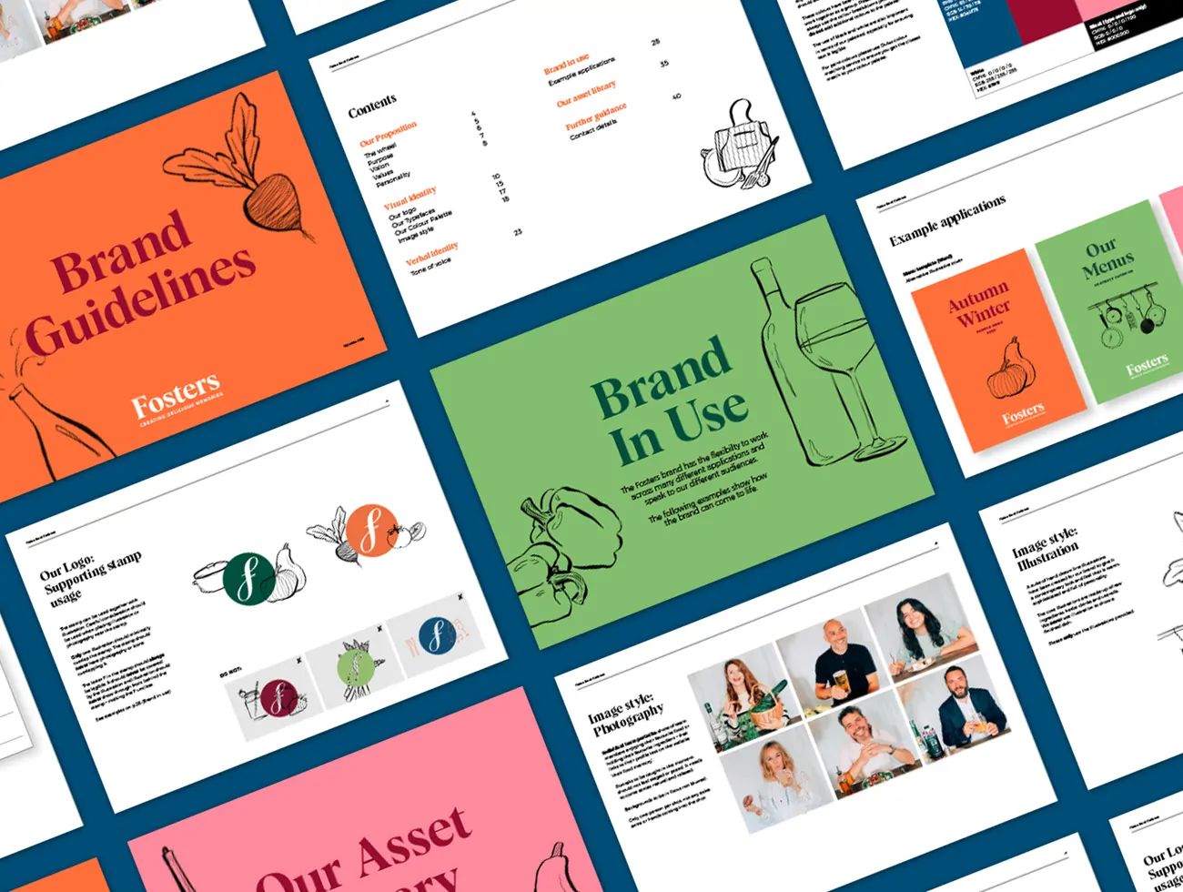
Our new brand positioning informs every aspect of Fosters’ visual and verbal identity, with a flexible brand that is supported by a suite of vibrant assets reflecting the joyful experiences their create. We developed a new wordmark, supported by an ‘F’ stamp which provides a connection to their former brand identity. For typography, we paired a characterful serif typeface with a contemporary san serif font, and added a handwritten typeface for a more human touch. We also developed a vibrant colour palette inspired by the rich natural ingredients they use in their catering.
Capturing warmth through photography and illustrations
Creating the sense of a joyful experience, our case study photography shows guests enjoying the events and food. To bring to life the warmth and friendliness of their team, we introduced portraits showing each member with their favourite food or drink – all highlighting the pleasure of working with Fosters.
We also developed a suite of imaginative hand-drawn illustrations depicting natural ingredients, cooking utensils and drinks. Used across print and digital, they help highlight Fosters’ creativity and warmth in a playful and engaging way.
Transforming the digital experience
The new website brings to life the joyful experience of partnering with Fosters. Our moodboard-inspired visual approach features overlapping images and illustrations, highlighting their abundant creativity. The website was designed with flexibility in mind, using module blocks to enable their team to easily add content and create new pages in the future.

Preparing the brand for the future
Our work perfectly reflects Fosters’ new brand proposition. To support their distinctive new brand identity into the future, we developed a toolkit of assets and guidelines that enable their team to communicate their brand with energy, creativity, flexibility and consistency across multiple channels.

You couldn't ask for a better team or service than that of Studio Noel. Simply unbeatable levels of service, creativity, patience, and thoughtfulness to achieve a website and rebrand that has catapulted the business forward and has directly impacted our success. We cannot recommend Studio Noel enough; the attentiveness and personable professionalism that they bring is like we are working with our own in-house design team.

Related projects
Swan, Shakespeare’s Globe Theatre
Redefining a landmark restaurant with a real sense of theatre
Bill’s restaurants
Helping a casual dining chain grow and flourish